Solution
Process
Personas
Competiror audit
App flows
Information architecture
Wireframes
Stule guide
Design iteration
Reflection

GoGrocery

GoGrocery is a concept mobile app for local grocery stores, designed to address two common sources of friction in physical shopping: finding products in-store and waiting at checkout.

Self-initiated concept

date

June 2026

Role

Product Designer

platform

iOS Mobile App

tools

Figma

Solution

Solution

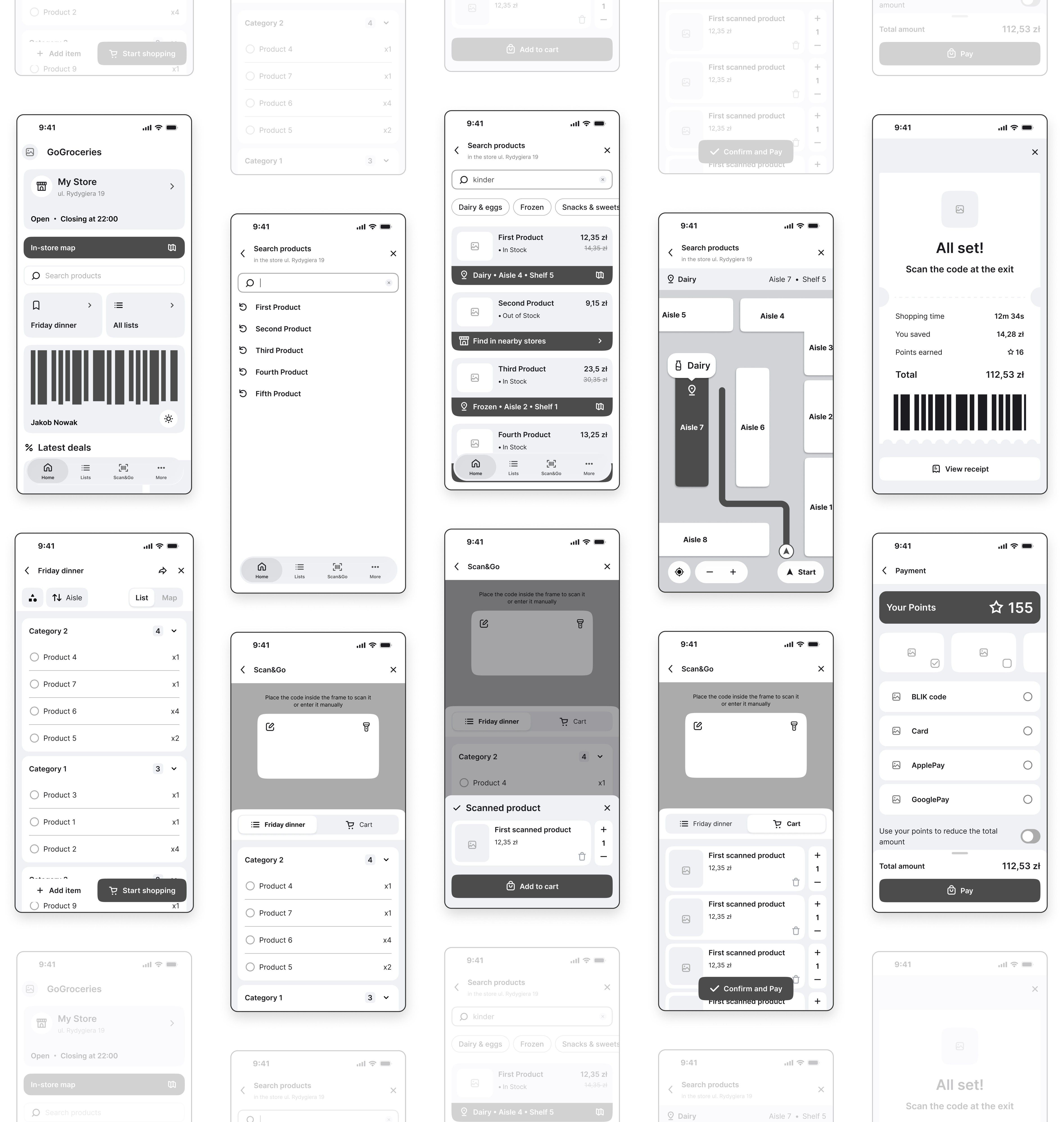
See the final design in action - full interactive flow in Figma

See the final design in action - full interactive flow in Figma

Process

Process

STEP 1

Analysis

Personas

Competitor audit

User journey maps
STEP 2

UX

User flows

Information architecture

Wireframes

STEP 3

UI

Colors, typography, components

Final design

Interactive prototype

Personas

Two personas were created from the shopping patterns. They helped me explore contrasting shopping contexts and design needs.

Personas

Two personas were created from the shopping patterns. They helped me explore contrasting shopping contexts and design needs.

Competitor audit

5 apps audited - 3 critical gaps identified.

Competitor audit

5 apps audited - 3 critical gaps identified.

Full competitor breakdown - Google Sheets - Comparison Table

Findings and insights - Google Docs - Research Report

GAP

OPPORTUNITY

Loyalty cards buried 3 taps deep

One-tap checkout hub

Apps useless without signal

Offline-first lists and cards

Single-user apps for a shared activity

Real-time collaborative lists

How might we…

…help shoppers find and collect the items they need efficiently while reducing unnecessary movement and effort in the store?

How might we…

…help shoppers find and collect the items they need efficiently while reducing unnecessary movement and effort in the store?

App flows

During the investigation 2 main app flows were identified.

App flows

During the investigation 2 main app flows were identified.

01

Find & Navigate

The core flow addressing the main pain point: helping users locate a product and navigate to it in-store without wandering.

02

Purchase

Covers the full shopping session from list to checkout, including the Scan&Go feature for a faster in-store experience.

Information Architecture

The IA was mapped out to define the app's structure and navigation hierarchy before moving into wireframing.

Information Architecture

The IA was mapped out to define the app's structure and navigation hierarchy before moving into wireframing.

Explore in more detail: FigJam - Information Architecture

Wireframes

Wireframes

Lo-Fi Wireframes

I used Crazy Eights to sketch out multiple layout ideas quickly before moving to Figma. The format - 8 sketches in 8 minutes - keeps the pace fast and helps avoid getting attached to one solution too early.

Lo-Fi Wireframes

I used Crazy Eights to sketch out multiple layout ideas quickly before moving to Figma. The format - 8 sketches in 8 minutes - keeps the pace fast and helps avoid getting attached to one solution too early.

Mid-Fi Wireframes

Black-and-white Figma frames focusing on layout structure and component placement, before visual style was applied.

Mid-Fi Wireframes

Black-and-white Figma frames focusing on layout structure and component placement, before visual style was applied.

Style guide

Style guide

Colours

Colours

Primary

#216960

Accent

#F38E63

#6372F3

Grayscale

#1F1F1F

#525252

#B8B8B8

#EBEBEB

#FAFAFA

Typography

Typography

Poppins
Poppins
Aa Bb Cc Dd Ee Ff Gg Hh Ii Jj Kk Ll Mm Nn Oo Pp Qq Rr Ss Tt Uu Vv Ww Xx Yy Zz
Lato
Lato
Aa Bb Cc Dd Ee Ff Gg Hh Ii Jj Kk Ll Mm Nn Oo Pp Qq Rr Ss Tt Uu Vv Ww Xx Yy Zz

Elements

Elements

Icons

Icons

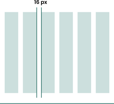
Grid system

Grid system

Test Plan

Before finalizing the concept, I used an AI-assisted scenario walkthrough to challenge the key flows from five hypothetical shopper perspectives. This was not real usability testing, and no participants were recruited. I treated the output as a design critique: a way to surface potential risks, prioritize questions, and decide what I would test with real users next.

Test Plan

Before finalizing the concept, I used an AI-assisted scenario walkthrough to challenge the key flows from five hypothetical shopper perspectives. This was not real usability testing, and no participants were recruited. I treated the output as a design critique: a way to surface potential risks, prioritize questions, and decide what I would test with real users next.

Design Iteration

These potential risks informed the iterations shown below. The changes improve the concept, but they still require testing with real users.

Design Iteration

These potential risks informed the iterations shown below. The changes improve the concept, but they still require testing with real users.

P1

One-Handed Design

P1

One-Handed Design

Action Controls

Primary actions were moved to the bottom of the screen for easier one-handed use while carrying groceries.

Before
After
GoGrocery UX Case Study - Diana Tsevan

P0

Color Contrast & Real-time Navigation

P2

Clean Maps

Map Screen

Improved contrast and reduced map clutter, plus a real-time navigation mode with a Start button - similar to a GPS experience.

Before
After
GoGrocery UX Case Study - Diana Tsevan

Accessibility

Good accessibility is good design for everyone. Features like voice input, vibration feedback, and one-handed controls aren't only for users with disabilities. They're equally useful whenever your hands are full, your eyes are busy, or you simply prefer a faster interaction.

Accessibility

Good accessibility is good design for everyone. Features like voice input, vibration feedback, and one-handed controls aren't only for users with disabilities. They're equally useful whenever your hands are full, your eyes are busy, or you simply prefer a faster interaction.

Considered in the Design

Color Contrast · P0

One-Handed Use · P1

Additional Considerations

Voice Input

Vibration Feedback

Sound Feedback

Reflection

Reflection

Label assumptions clearly

Without access to real users, I relied on exploratory research, personas, and an AI-assisted critique. This helped me move the concept forward, but it also showed me why assumptions must be clearly separated from user evidence.

Plan validation before claiming outcomes

Choosing KPIs helped me define what success could mean, but I did not collect real measurements. The next step would be moderated sessions with shoppers, using task time, errors, and qualitative feedback to evaluate the core flows.

Consider feasibility earlier

Indoor navigation, offline access, live inventory, and Scan&Go depend on store systems and operational constraints. In a real product setting, I would investigate those dependencies before moving the concept toward implementation.