GoGrocery
GoGrocery is a concept mobile app for local grocery stores, designed to address two common sources of friction in physical shopping: finding products in-store and waiting at checkout.
date
June 2026
Role
Product Designer
Self-initiated concept


Challenge
Design a mobile app for a local grocery store that minimizes the time spent searching for items and waiting in checkout lines.
Challenge
Design a mobile app for a local grocery store that minimizes the time spent searching for items and waiting in checkout lines.
Solution
GoGrocery brings product discovery, aisle-level navigation, shopping lists, Scan&Go, and checkout into one connected flow. The concept aims to make in-store shopping faster and easier to navigate.
Solution
GoGrocery brings product discovery, aisle-level navigation, shopping lists, Scan&Go, and checkout into one connected flow. The concept aims to make in-store shopping faster and easier to navigate.
See the final design in action - full interactive flow in Figma
Process
This project followed a Design Thinking-inspired process, moving from exploratory research and defined assumptions through prototyping and an AI-assisted design review.
Process
This project followed a Design Thinking-inspired process, moving from exploratory research and defined assumptions through prototyping and an AI-assisted design review.


User research
Two shopping patterns were created from exploratory research, my own assumptions, and AI-assisted synthesis. They served as working hypotheses for the concept.
User research
Two shopping patterns were created from exploratory research, my own assumptions, and AI-assisted synthesis. They served as working hypotheses for the concept.
Quick Solo Trip
Prioritizes speed and efficiency - every second counts.
Full Weekly Haul
Struggles with physical fatigue and backtracking across the store.
Competitor audit
5 apps audited - 3 critical gaps identified.
Competitor audit
5 apps audited - 3 critical gaps identified.
Full competitor breakdown - Google Sheets - Comparison Table
Findings and insights - Google Docs - Research Report


- 01
Friction at checkout
Loyalty cards buried 3 taps deep, scanners hidden behind ads, frequent logouts at the register - a consistent pattern across Lidl, Biedronka, and Carrefour.
One checkout hub - card, payment, scanner - one tap from the home screen.
- 02
No signal, no app
All five apps require a stable connection for loyalty cards and shopping lists - exactly when in-store signal is unreliable. No competitor has addressed offline access.
Shopping lists and loyalty cards could be available offline.
- 03
Built for one, used by many
Shopping is a shared activity - couples, families, flatmates. None of the five apps support real-time collaborative lists.
Collaborative lists with live updates.
- 01
Friction at checkout
Loyalty cards buried 3 taps deep, scanners hidden behind ads, frequent logouts at the register - a consistent pattern across Lidl, Biedronka, and Carrefour.
One checkout hub - card, payment, scanner - one tap from the home screen.
- 02
No signal, no app
All five apps require a stable connection for loyalty cards and shopping lists - exactly when in-store signal is unreliable. No competitor has addressed offline access.
Shopping lists and loyalty cards could be available offline.
- 03
Built for one, used by many
Shopping is a shared activity - couples, families, flatmates. None of the five apps support real-time collaborative lists.
Collaborative lists with live updates.
- 01
Friction at checkout
Loyalty cards buried 3 taps deep, scanners hidden behind ads, frequent logouts at the register - a consistent pattern across Lidl, Biedronka, and Carrefour.
One checkout hub - card, payment, scanner - one tap from the home screen.
- 02
No signal, no app
All five apps require a stable connection for loyalty cards and shopping lists - exactly when in-store signal is unreliable. No competitor has addressed offline access.
Shopping lists and loyalty cards could be available offline.
- 03
Built for one, used by many
Shopping is a shared activity - couples, families, flatmates. None of the five apps support real-time collaborative lists.
Collaborative lists with live updates.
Personas
Two personas were created from the shopping patterns. They helped me explore contrasting shopping contexts and design needs.
Personas
Two personas were created from the shopping patterns. They helped me explore contrasting shopping contexts and design needs.

Jakub Nowak
24 years old
Software Developer
Quick solo trip
"I come to the store to quickly get what I need without unnecessary hassle"
One specific item fast after a long workday.
Pain: No way to locate a product without wandering or asking staff.

Maria Wilk
42 years old
Accountant
Full weekly haul
"I want my weekly grocery shopping to be easy and not physically draining"
Full family shop, long list, heavy cart.
Pain: Backtracks through crowded aisles for forgotten items.

Jakub Nowak
24 years old
Software Developer
Quick solo trip
"I come to the store to quickly get what I need without unnecessary hassle"
One specific item fast after a long workday.
Pain: No way to locate a product without wandering or asking staff.

Maria Wilk
42 years old
Accountant
Full weekly haul
"I want my weekly grocery shopping to be easy and not physically draining"
Full family shop, long list, heavy cart.
Pain: Backtracks through crowded aisles for forgotten items.

Jakub Nowak
24 years old
Software Developer
Quick solo trip
"I come to the store to quickly get what I need without unnecessary hassle"
One specific item fast after a long workday.
Pain: No way to locate a product without wandering or asking staff.

Maria Wilk
42 years old
Accountant
Full weekly haul
"I want my weekly grocery shopping to be easy and not physically draining"
Full family shop, long list, heavy cart.
Pain: Backtracks through crowded aisles for forgotten items.
Pain points
Two problem hypotheses were selected to guide the concept. They would need to be validated with real shoppers before further product development.
Pain points
Two problem hypotheses were selected to guide the concept. They would need to be validated with real shoppers before further product development.
Time-consuming navigation
Shoppers feel stressed when they can't find items quickly.
This guides the design to prioritize clear, instant access to product location data.
Physical and mental fatigue
Navigating a large store with a long list is exhausting.
This guides the design to focus on organizing the shopping process to reduce unnecessary movement.
User Journey Maps
I mapped two scenarios to explore possible friction points and opportunities that shaped the concept’s core features.
User Journey Maps
I mapped two scenarios to explore possible friction points and opportunities that shaped the concept’s core features.
Explore the maps in detail: Google Sheets - User Journey Maps
Problem & Hypothesis statements
Problem statements
Hypothesis statements
User stories & User flows
Expand the User story and explore the User flow.
User stories & User flows
Expand the User story and explore the User flow.
Explore in more detail: FigJam - User Flows
Information Architecture
The IA was mapped out to define the app's structure and navigation hierarchy before moving into wireframing.
Information Architecture
The IA was mapped out to define the app's structure and navigation hierarchy before moving into wireframing.
Explore in more detail: FigJam - Information Architecture

Wireframes
Wireframes
Lo-Fi Wireframes
I used Crazy Eights to sketch out multiple layout ideas quickly before moving to Figma. The format - 8 sketches in 8 minutes - keeps the pace fast and helps avoid getting attached to one solution too early.
Lo-Fi Wireframes
I used Crazy Eights to sketch out multiple layout ideas quickly before moving to Figma. The format - 8 sketches in 8 minutes - keeps the pace fast and helps avoid getting attached to one solution too early.


Find & Navigate flow
The core flow addressing the main pain point: helping users locate a product and navigate to it in-store without wandering.
Find & Navigate flow
The core flow addressing the main pain point: helping users locate a product and navigate to it in-store without wandering.

01.
Home

02.
Product search

03.
Product search: Results

04.
Store navigation

01.
Home

02.
Product search

03.
Product search: Results

04.
Store navigation
Purchase Flow
Covers the full shopping session from list to checkout, including the Scan&Go feature for a faster in-store experience.
Purchase Flow
Covers the full shopping session from list to checkout, including the Scan&Go feature for a faster in-store experience.

01.
Home

02.
Shopping list

03.
Scan&Go: Scanner & List

04.
Scan&Go: Scanned product

05.
Scan&Go: Scanner & Cart

06.
Scan&Go: Payment

07.
Scan&Go: Payment Success
Mid-Fi Wireframes
Black-and-white Figma frames focusing on layout structure and component placement, before visual style was applied.
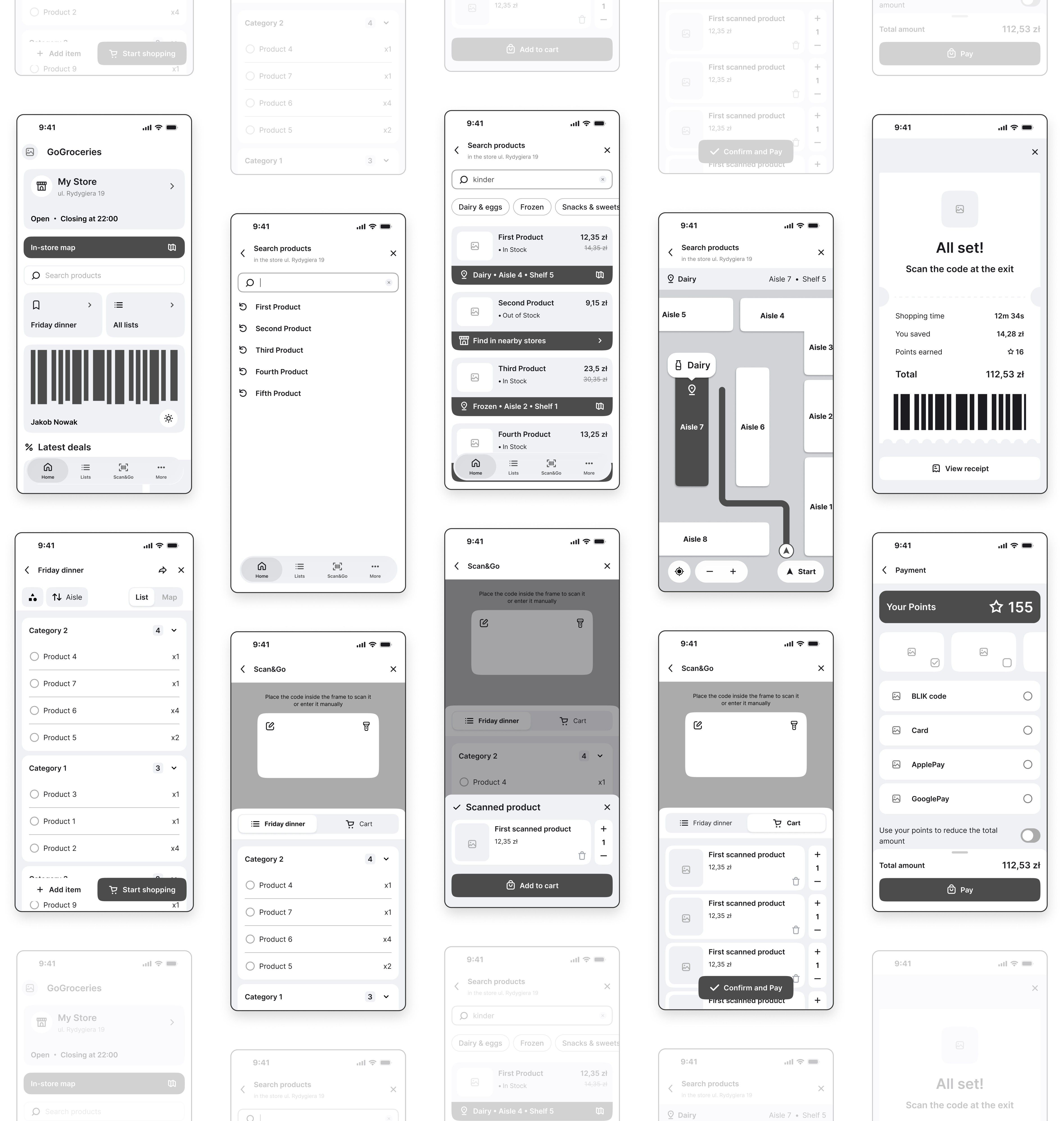
Mid-Fi Wireframes
Black-and-white Figma frames focusing on layout structure and component placement, before visual style was applied.
Find & Navigate flow

01.
Home

02.
Product search

03.
Product search: Results

04.
Store navigation

01.
Home

02.
Product search

03.
Product search: Results

04.
Store navigation
Purchase Flow
Purchase Flow

01.
Home

02.
Shopping list

03.
Scan&Go: Scanner & List

04.
Scan&Go: Scanned product

05.
Scan&Go: Scanner & Cart

06.
Scan&Go: Payment

07.
Scan&Go: Payment Success
Hi-Fi Design
The final visual design with colour, typography, and real content applied across both key flows.
Hi-Fi Design
The final visual design with colour, typography, and real content applied across both key flows.
Find & Navigate flow

01.
Home

02.
Product search

03.
Product search: Results

04.
Store navigation

01.
Home

02.
Product search

03.
Product search: Results

04.
Store navigation
Purchase Flow
Purchase Flow

01.
Home

02.
Shopping list

03.
Scan&Go: Scanner & List

04.
Scan&Go: Scanned product

05.
Scan&Go: Scanner & Cart

06.
Scan&Go: Payment

07.
Scan&Go: Payment Success
See the final design in action - full interactive flow in Figma
Test Plan
Before finalizing the concept, I used an AI-assisted scenario walkthrough to challenge the key flows from five hypothetical shopper perspectives. This was not real usability testing, and no participants were recruited. I treated the output as a design critique: a way to surface potential risks, prioritize questions, and decide what I would test with real users next.
Test Plan
Before finalizing the concept, I used an AI-assisted scenario walkthrough to challenge the key flows from five hypothetical shopper perspectives. This was not real usability testing, and no participants were recruited. I treated the output as a design critique: a way to surface potential risks, prioritize questions, and decide what I would test with real users next.
KPIs
These three metrics were selected for a future usability study with real participants. No quantitative results were collected in this concept project.
KPIs
These three metrics were selected for a future usability study with real participants. No quantitative results were collected in this concept project.
- 01
Time on Task
How long participants need to complete tasks such as finding a product or checking out.
Speed is central to the product concept, so task time would help evaluate whether the flows actually reduce friction.
- 02
Error Rate
Where participants make mistakes, miss controls, or take unintended paths.
The navigation, Scan&Go, and payment flows include several steps where confusion could create serious friction.
- 03
System Usability Scale (SUS)
Participants' overall perception of ease of use after completing the core flows.
SUS would provide a simple benchmark for comparing later iterations alongside qualitative observations.
- 01
Time on Task
How long participants need to complete tasks such as finding a product or checking out.
Speed is central to the product concept, so task time would help evaluate whether the flows actually reduce friction.
- 02
Error Rate
Where participants make mistakes, miss controls, or take unintended paths.
The navigation, Scan&Go, and payment flows include several steps where confusion could create serious friction.
- 03
System Usability Scale (SUS)
Participants' overall perception of ease of use after completing the core flows.
SUS would provide a simple benchmark for comparing later iterations alongside qualitative observations.
- 01
Time on Task
How long participants need to complete tasks such as finding a product or checking out.
Speed is central to the product concept, so task time would help evaluate whether the flows actually reduce friction.
- 02
Error Rate
Where participants make mistakes, miss controls, or take unintended paths.
The navigation, Scan&Go, and payment flows include several steps where confusion could create serious friction.
- 03
System Usability Scale (SUS)
Participants' overall perception of ease of use after completing the core flows.
SUS would provide a simple benchmark for comparing later iterations alongside qualitative observations.
Potential Usability Risks
The AI-assisted walkthrough surfaced four potential usability risks. These are hypotheses to validate with real users, not confirmed findings. I prioritized them using my own design judgment.
Potential Usability Risks
The AI-assisted walkthrough surfaced four potential usability risks. These are hypotheses to validate with real users, not confirmed findings. I prioritized them using my own design judgment.
- P0
High Contrast for Faster Shopping
The map's pale colors and thin route line made the path hard to follow at a glance, slowing users down mid-shop.
TO DO: Use a thicker, brighter route line and a higher-contrast map background.
- P0
Real-time Navigation over Static Plans
A static 2D map wasn't enough - users expected a GPS-like experience with a live position marker to orient themselves in-store.
TO DO: This guides the design to focus on organizing the shopping process to reduce unnecessary movement.
- P1
One-Handed Design for Busy Shoppers
Primary buttons placed near the top were hard to reach one-handed - a common scenario when carrying a basket or bags.
TO DO: Move primary controls to the bottom of the screen for one-handed access.
- P2
Clean Maps for Clearer Paths
Large, fixed product cards covered the map, forcing users to move or dismiss them just to see their route.
TO DO: Make product cards smaller and collapsible, with swipe-to-dismiss to keep the map visible.
High Contrast for Faster Shopping
The map's pale colors and thin route line made the path hard to follow at a glance, slowing users down mid-shop.
Design response: Increase map contrast and use a thicker, more visible route line.
One-Handed Design for Busy Shoppers
Primary buttons placed near the top were hard to reach one-handed - a common scenario when carrying a basket or bags.
Design response: Move primary controls toward the bottom of the screen for easier one-handed reach.
Real-time Navigation over Static Plans
A static 2D map wasn't enough - users expected a GPS-like experience with a live position marker to orient themselves in-store.
Design response: Add a clear Start navigation state and a live-position concept, while treating indoor positioning as a technical feasibility question.
Clean Maps for Clearer Paths
Large, fixed product cards covered the map, forcing users to move or dismiss them just to see their route.
Design response: Make product cards smaller and collapsible so they do not obscure the route.
Design Iteration
These potential risks informed the iterations shown below. The changes improve the concept, but they still require testing with real users.
Design Iteration
These potential risks informed the iterations shown below. The changes improve the concept, but they still require testing with real users.
P1
One-Handed Design
P1
One-Handed Design
Action Controls
Primary actions were moved to the bottom of the screen for easier one-handed use while carrying groceries.
P0
Color Contrast & Real-time Navigation
P2
Clean Maps
Map Screen
Improved contrast and reduced map clutter, plus a real-time navigation mode with a Start button - similar to a GPS experience.
Accessibility
Good accessibility is good design for everyone. Features like voice input, vibration feedback, and one-handed controls aren't only for users with disabilities. They're equally useful whenever your hands are full, your eyes are busy, or you simply prefer a faster interaction.
Accessibility
Good accessibility is good design for everyone. Features like voice input, vibration feedback, and one-handed controls aren't only for users with disabilities. They're equally useful whenever your hands are full, your eyes are busy, or you simply prefer a faster interaction.
Considered in the Design
- 01
Color Contrast · P0
High-contrast colors and a clearer route line improve visibility for users with visual impairments - addressed in the Map Screen redesign above.
This guides the design to prioritize clear, instant access to product location data.
- 02
One-Handed Use · P1
Moving controls to the bottom supports users with permanent, temporary, or situational limitations - addressed in the Action Controls redesign above.
This guides the design to focus on organizing the shopping process to reduce unnecessary movement.
- 01
Color Contrast · P0
High-contrast colors and a clearer route line improve visibility for users with visual impairments - addressed in the Map Screen redesign above.
This guides the design to prioritize clear, instant access to product location data.
- 02
One-Handed Use · P1
Moving controls to the bottom supports users with permanent, temporary, or situational limitations - addressed in the Action Controls redesign above.
This guides the design to focus on organizing the shopping process to reduce unnecessary movement.
- 01
Color Contrast · P0
High-contrast colors and a clearer route line improve visibility for users with visual impairments - addressed in the Map Screen redesign above.
This guides the design to prioritize clear, instant access to product location data.
- 02
One-Handed Use · P1
Moving controls to the bottom supports users with permanent, temporary, or situational limitations - addressed in the Action Controls redesign above.
This guides the design to focus on organizing the shopping process to reduce unnecessary movement.
Color Contrast · P0
I increased the contrast of the route and map elements to support clearer visual scanning.
One-Handed Use · P1
I moved primary actions lower in the interface to improve reachability when a shopper is carrying a basket or bags.
Additional Considerations
- 03
Voice Input
Enables hands-free product search, useful for users with visual or motor impairments and in everyday hands-busy moments.
This guides the design to prioritize clear, instant access to product location data.
- 04
Vibration Feedback
Confirms completed actions (product search, barcode scan, and adding to cart) without requiring users to look at the screen.
This guides the design to focus on organizing the shopping process to reduce unnecessary movement.
- 05
Sound Feedback
Confirms successful payment with an audio cue, adding reassurance beyond visual confirmation.
This guides the design to focus on organizing the shopping process to reduce unnecessary movement.
- 03
Voice Input
Enables hands-free product search, useful for users with visual or motor impairments and in everyday hands-busy moments.
This guides the design to prioritize clear, instant access to product location data.
- 04
Vibration Feedback
Confirms completed actions (product search, barcode scan, and adding to cart) without requiring users to look at the screen.
This guides the design to focus on organizing the shopping process to reduce unnecessary movement.
- 05
Sound Feedback
Confirms successful payment with an audio cue, adding reassurance beyond visual confirmation.
This guides the design to focus on organizing the shopping process to reduce unnecessary movement.
- 03
Voice Input
Enables hands-free product search, useful for users with visual or motor impairments and in everyday hands-busy moments.
This guides the design to prioritize clear, instant access to product location data.
- 04
Vibration Feedback
Confirms completed actions (product search, barcode scan, and adding to cart) without requiring users to look at the screen.
This guides the design to focus on organizing the shopping process to reduce unnecessary movement.
- 05
Sound Feedback
Confirms successful payment with an audio cue, adding reassurance beyond visual confirmation.
This guides the design to focus on organizing the shopping process to reduce unnecessary movement.
Voice Input
A future accessibility feature to explore with people who benefit from hands-free interaction.
Vibration Feedback
This could provide non-visual confirmation for search, scanning, and cart actions.
Sound Feedback
This could confirm a successful payment while respecting mute settings and giving users control over audio feedback.